Engineering · Accessibility · Shipping Notes
The Business Case for Web Accessibility: The Customers Your Website Quietly Turns Away
Accessibility is a business decision that determines whether real customers can buy, book, subscribe, compare, apply, and trust your website.
The Blind Aunt With Money to Spend
A rich blind aunt wants to buy a birthday gift for her nephew.
She has the money. She has the intention. She has the emotional reason. She knows the child’s age, what he likes, and what she wants to spend. She opens an online store, searches for the product, adds it to cart, and tries to check out.
Then the website quietly tells her, without saying the words directly: “This place was not built for you.”
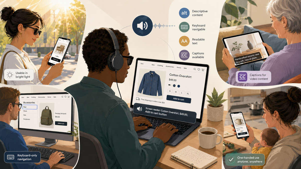
The product images have no meaningful alt text, so her screen reader announces something useless like “image123.jpg.” The size selector is a custom dropdown that cannot be reached with a keyboard. The “Add to Cart” button is visually styled like a button but implemented as a clickable div, so assistive technology does not understand it properly. The checkout form says there is an error, but it does not tell her which field has the error. The payment modal traps focus. The promo banner interrupts the screen reader. The delivery date picker only works with a mouse.
She is not poor. She is not uninterested. She is not outside the target market.
She is simply blocked.
That is one of the most misunderstood parts of accessibility. Many teams still think accessibility is mainly about charity, compliance, or adding extra features for a small group of users. But accessibility is also about commerce. It is about whether people who already want to use your product can actually use it.
The World Health Organization estimates that about 1.3 billion people experience significant disability, roughly 16% of the global population, or 1 in 6 people. (World Health Organization) That number does not include every temporary, situational, ageing-related, device-related, or environment-related limitation that affects how people use websites every day.
Businesses shouldn’t just ask, “Are we being inclusive?”
The sharper business question is, “How many customers are we silently turning away?”
Accessibility Is Not an Edge Case
A common mistake in product development is treating disabled users as rare exceptions. Teams design for the imagined “normal user” first, then maybe add accessibility later if there is time.
But the “normal user” is a fragile assumption.
People use websites while tired, distracted, injured, ageing, carrying a child, commuting, recovering from surgery, using low-end devices, dealing with poor internet, holding a phone with one hand, or trying to complete a transaction under stress.
The W3C explains that web accessibility benefits not only people with permanent disabilities, but also older people, people with temporary disabilities like a broken arm or lost glasses, people in situational limitations such as bright sunlight or environments where they cannot listen to audio, and people using slow or expensive internet connections. (W3C)
That means accessibility is user experience under real-world pressure.
A website that can only be used by someone with perfect sight, perfect motor control, perfect hearing, perfect concentration, a large screen, fast internet, and a quiet room is a fragile interface pretending to be complete.
The Blind Aunt Is a Customer, Not a Case Study
Let us return to the aunt.
She wants to buy something for her nephew. That simple action touches many parts of modern web development:
She needs search to work clearly.
She needs product names and descriptions to be understandable without relying only on images.
She needs filters that can be reached and changed with a keyboard.
She needs product options, such as size, colour, bundle, delivery location, and quantity, to expose their state correctly.
She needs error messages that are connected to the right form fields.
She needs payment flows that do not disappear into inaccessible modals.
She needs confirmation messages that are announced properly.
She needs trust signals, refund policies, delivery terms, and contact options that are readable and navigable.
None of these are “extra.” They are the actual buying journey.
When these things fail, the business does not only lose an accessibility audit score. It loses a customer who was already willing to pay.
In many cases, it also loses the people around that customer. If the aunt cannot use your store, she may ask someone else to buy the gift from a competitor. If that competitor works better, the family may remember that competitor next time. Accessibility failures sometimes look like abandoned carts, low conversion, unexplained drop-offs, or customers who never return.
Disability Can Be Permanent, Temporary, or Situational
Accessibility becomes easier to understand when we stop seeing disability as one fixed category.
A permanent disability may be blindness, low vision, deafness, limited mobility, tremors, cognitive disability, chronic illness, or another long-term condition.
A temporary disability may be a broken wrist, eye infection, migraine, recovering from surgery, lost glasses, voice loss, or medication side effects.
A situational limitation may be bright sunlight making a screen hard to see, a noisy bus making audio useless, a baby sleeping beside you so you cannot play sound, one hand occupied while using your phone, low battery forcing reduced brightness, or unstable internet making heavy pages painful to use.
The design implications overlap.
Captions help deaf users, but they also help someone watching a video in a noisy public place.
Good colour contrast helps low-vision users, but it also helps someone using their phone under sunlight.
Keyboard navigation helps people who cannot use a mouse, but it also helps power users, people with broken trackpads, and users filling long forms quickly.
Clear form labels help screen reader users, but they also help everyone understand what information is expected.
Readable content helps people with cognitive disabilities, but it also helps tired users, hurried users, second-language readers, and users comparing many options.
This is why accessibility should be treated as a design quality that improves the resilience of the whole product.
Real Situations Where Accessibility Affects Buying and Interaction
A blind customer wants to buy groceries online. If product names, prices, discounts, and quantity controls are not properly labelled, shopping becomes guesswork.
A low-vision customer wants to compare insurance plans. If the page uses tiny text, weak contrast, and information hidden inside decorative cards, they may not be able to compare options confidently.
A deaf customer wants to understand a product demo. If the only explanation is in an uncaptioned video, the message is locked away.
A person with hand tremors wants to book a hotel. If small buttons are placed too closely together, selecting the wrong date or room becomes easy.
A person with a broken arm wants to order medicine online. If the entire process depends on precise mouse movement or drag-and-drop interactions, the site becomes unnecessarily difficult.
A parent holding a baby wants to pay a bill with one hand. If the mobile interface requires awkward gestures, tiny tap targets, or repeated re-entry after errors, the task becomes frustrating.
An elderly person wants to renew a subscription. If the website uses confusing icons, disappearing menus, and unclear error messages, the issue is poor interaction design, and not age.
A user with dyslexia wants to read terms before paying. If the text is dense, poorly spaced, and filled with vague legal or marketing language, trust drops.
A person with anxiety wants to complete a government or banking form. If the session times out without warning, errors appear aggressively, and progress is not saved, the design adds pressure to an already stressful task.
A user on a slow connection wants to buy a ticket before it sells out. If the page is bloated with heavy scripts, autoplay videos, and layout shifts, performance becomes an accessibility barrier.
A colour-blind user wants to understand a dashboard. If status is communicated only through red, green, and yellow indicators without labels or icons, the interface hides meaning.
A person using a screen reader wants to apply for a job. If the form fields are unlabeled, the upload component is inaccessible, and the “Submit” button gives no confirmation, the company may lose strong applicants before they ever enter the hiring pipeline.
These are ordinary web tasks: buying, booking, applying, subscribing, learning, comparing, paying, and contacting support.
The Web Still Has a Serious Accessibility Gap
This is not a solved problem.
The WebAIM Million 2026 report found that 95.9% of the top one million home pages had detectable WCAG 2 failures. (WebAIM) That figure only covers automatically detectable issues, so it does not capture every real barrier users may experience.
This matters because many accessibility problems are not obvious during a normal visual review. A page can look beautiful and still be unusable with a screen reader. A checkout flow can look polished and still fail keyboard navigation. A form can look simple and still be inaccessible because labels, focus order, validation, and error states are poorly implemented.
This is why accessibility cannot be reduced to “does it look clean?”
A clean interface can still exclude people.
The Market Perspective: Another Set of Customers
There is a direct business argument here.
People with disabilities buy things. Their families buy things. Their friends buy things. Their caregivers buy things. Their workplaces buy tools. Their communities recommend products. Their needs influence household decisions, travel decisions, health decisions, education decisions, entertainment decisions, financial decisions, and technology decisions.
The disability market is not small. The 2024 Global Economics of Disability report, listed by AccessibleEU, describes the disability marketplace across the United States, United Kingdom, European Union, and Canada alone as representing over $2.6 trillion in disposable income. (AccessibleEU)
That is purchasing power.
For a business, accessibility is about opening the door to customers who already exist. It is about reducing friction in the funnel. It is about increasing trust. It is about making sure a person who wants to buy, book, register, donate, subscribe, or apply does not leave because the interface could not accommodate them.
If a company spends money on ads to attract traffic, then loses users because the site cannot be navigated, the problem is waste.
You paid to bring people to a door that some of them could not open.
Accessibility Improves Conversion Because It Removes Unnecessary Friction
Conversion is often discussed through copy, pricing, funnels, landing pages, CTAs, and analytics. Those things matter. But conversion also depends on whether users can physically and cognitively complete the action.
Can they find the product?
Can they understand the offer?
Can they compare options?
Can they operate the controls?
Can they recover from mistakes?
Can they complete payment?
Can they trust what just happened?
Accessibility improves these steps because it forces teams to make the interface more explicit.
Good headings improve page scanning.
Proper labels improve forms.
Predictable focus states improve navigation.
Sufficient contrast improves readability.
Captions improve comprehension.
Semantic HTML improves assistive technology support.
Clear error messages improve recovery.
Reduced motion options protect users who are sensitive to animation.
Keyboard support improves operability.
Performance improvements reduce barriers for users on weak devices or poor networks.
These improvements help disabled users directly, but they also help many other users indirectly. That is the strategic advantage. Accessibility work often produces broader product quality.
The Hidden Cost of Inaccessible Design
Inaccessible design does not always fail loudly.
Sometimes users do not complain. They just leave.
A blind shopper may abandon the checkout.
A low-vision user may choose another bank.
A deaf student may skip your course.
A person with motor difficulty may give up on your booking form.
An older customer may call support instead of using the website.
A candidate may abandon a job application.
A buyer may ask a relative to use another platform.
A donor may fail to complete a donation.
From the business side, these may appear as generic metrics: bounce rate, abandoned cart, low completion rate, high support tickets, poor activation, weak retention, or unexplained drop-off.
But behind those numbers may be people who were willing to act and could not.
That is why accessibility should be connected to analytics, QA, design review, and product strategy. It should not be buried as a late-stage compliance task.
Accessibility Is Also a Brand Signal
People remember how a product makes them feel.
When a website works well with a screen reader, supports keyboard navigation, respects reduced motion, handles errors clearly, and presents content in a readable structure, it communicates care.
When it fails those things, it communicates the opposite.
For disabled users, accessibility can determine whether a brand feels usable, safe, respectful, and worth returning to. For families and communities around them, it can also influence recommendation. A product that works well for one person with specific needs often becomes the default choice because it reduces stress for everyone involved.
This is especially important in sectors where trust is central: healthcare, banking, insurance, education, ecommerce, travel, government services, SaaS, legal services, and employment platforms.
In these spaces, accessibility is credibility.
The Developer’s Role: Accessibility Starts in the Implementation
Accessibility is also deeply technical and should not only be a designer’s responsibility.
A designer may define contrast, spacing, states, and layout, but the developer determines whether the final interface exposes meaning correctly to browsers and assistive technologies.
For example, a button should usually be a real button, not a clickable div.
A link should navigate somewhere; a button should perform an action.
An input should have a proper label.
A modal should manage focus.
A dropdown should expose its expanded and collapsed state.
An error message should be connected to the field it describes.
A page should have a logical heading structure.
Images that communicate meaning should have meaningful alt text.
Decorative images should not create noise for screen readers.
Interactive controls should be reachable and usable by keyboard.
Dynamic updates should be announced where necessary.
This is why semantic HTML still matters. It gives the browser, assistive technologies, and users a shared structure. When developers throw away native semantics and rebuild everything with generic elements, they often inherit accessibility responsibilities they do not even know exist.
A custom component is not automatically bad. But if a team builds a custom select, custom checkbox, custom modal, custom tab system, or custom combobox, they must also rebuild the expected keyboard behaviour, focus management, roles, states, and announcements.
That is serious engineering work.
Accessibility Should Be Part of the Product Lifecycle
The worst time to think about accessibility is after the product is already built.
At that point, teams start “fixing accessibility” as if it is a layer of paint. But many accessibility issues are architectural. They come from component decisions, design system gaps, content structure, routing behaviour, form patterns, modal patterns, state management, and QA culture.
A better approach is to include accessibility from the beginning.
During product planning, identify critical user journeys: signup, search, checkout, booking, payment, account recovery, profile updates, application submission, content consumption, and support.
During design, check contrast, text size, layout, focus states, error states, motion, reading order, and responsive behaviour.
During development, use semantic HTML, accessible component patterns, ARIA only when necessary, keyboard support, and meaningful state management.
During testing, include automated checks, keyboard-only testing, screen reader smoke testing, zoom testing, reduced motion testing, colour contrast testing, and real-device testing.
During QA, treat accessibility failures as user journey failures, not just technical warnings.
During analytics review, investigate drop-offs in forms, checkout flows, onboarding, and search interactions with accessibility in mind.
The goal is to stop treating accessibility as an afterthought.
Practical Accessibility Checks for Revenue-Critical Pages
For ecommerce, SaaS, booking platforms, fintech, education platforms, and service websites, start with the pages that directly affect business outcomes.
Check your homepage, product pages, pricing page, signup flow, login flow, checkout flow, payment flow, dashboard, forms, search, filters, modals, and support pages.
Ask these questions:
Can the full journey be completed with only a keyboard?
Can a screen reader user understand the page structure?
Are buttons and links implemented with correct semantic elements?
Are form labels clear and programmatically connected?
Are errors specific, visible, and announced properly?
Is colour used as the only way to communicate meaning?
Is text readable at higher zoom levels?
Are tap targets large enough on mobile?
Do images that carry meaning have useful alt text?
Do videos have captions or transcripts?
Does focus move predictably through the interface?
Do modals trap and release focus correctly?
Does the site respect reduced motion preferences?
Can users recover from mistakes without losing all progress?
Does the page remain usable on slow connections?
If the answer is no, that is not merely an accessibility issue. It is a business issue.
The “Another Set of Customers” Mindset
One useful way to reframe accessibility is this:
Do not only think of disabled users as people who need help. Think of them as customers with money, taste, urgency, preferences, loyalty, and choices.
The blind aunt is not asking the store to pity her. She wants to buy the gift.
The deaf student is not asking the course platform to make a statement. She wants to learn.
The low-vision investor is not asking the fintech app for sympathy. He wants to manage money.
The elderly customer is not asking the bank to slow down innovation. She wants to complete a transaction safely.
The parent holding a baby is not asking for special treatment. He wants to finish payment before the child wakes up.
Accessibility is not about lowering the standard. It is about removing unnecessary barriers between people and the value they already want.
That is the opportunity.
When a business makes its website accessible, it does not only serve “disabled users.” It serves a broader market of people using the web in real human conditions.
Closing Thought
The aunt had money to spend.
The nephew had a gift to receive.
The business had a sale waiting to happen.
Nothing was missing except access.
That is the cost of inaccessible web experiences. Sometimes they simply appear as one more abandoned cart, one more unfinished form, one more user who never comes back.
A website is not truly working because it works for the team that built it. It is working when the people who need it can use it.
And in business terms, accessibility is a door to customers many competitors are still leaving outside.